Mapping Hospital Accessibility with OpenStreetMap
April 3, 2023
15 min read
Rural Hospital Accessibility
Rural Americans face many challenges accessing medical care. Hospitals and other medical facilities tend to cluster in denser population areas, leaving residents of rural areas without nearby access to medical care, especially for specialty medicine.
According to the Department of Health and Human Services, 65.83% of designated Health Professional Shortage Areas are rural. 1 2
Increased distance to a hospital during a medical emergency also increases mortality rates. A 2007 study found on average, a 10km increase in distance to the hospital during an emergency resulted in a 1% increase in mortality. 3
Due to these factors, residents without access to nearby hospitals may face worse medical outcomes.
Driving Distance Hospital Accessibility
For this project, I wanted to see how much of my state, Virginia, was within a given driving time of a hospital. Specifically, how much is within 10 minutes, 20 minutes, 30 minutes, and 40 minutes of a hospital?
If you're dying to know the answer, the interactive map answering this question can be found here.
OpenStreetMap
OpenStreetMap (OSM) is a crowd-sourced map dataset spanning the entire world. For this project, I used the data in two ways:
- finding a list of hospitals and their locations
- finding the Isochrone map4 for each hospital
I used the OSM extract provided by GeoFabrik for the state of Virginia.
Finding all hospitals in Virginia
To find all hospitals in OpenStreetMap, I searched for the tag
amenity=hospital. This tag differs from amenity=clinic subtly.
The difference between a clinic and a hospital is not always obvious.
However, the main distinction is that a hospital offers inpatient
care, while a clinic does not.
To search the dataset, I first considered using the Overpass API 5, but I hit two problems:
- the size of my query was too big to use the free public instance (Overpass Turbo)
- setting up the software to run locally seemed too complicated compared to just using PostGIS
So ultimately I decided to just use PostGIS, which was more familiar to me.
I used osm2pgsql to import the data, and then could easily query it using SQL.
To get all hospitals names and locations, only two simple queries were required:
To get all hospitals that were tagged as points:
SELECT ST_AsText(ST_Transform(way,4326)) as centroid,osm_id,name
FROM planet_osm_point
WHERE amenity='hospital';
And to get all hospitals that were tagged as polygons:
SELECT ST_AsText(ST_Transform(ST_Centroid(way),4326)) AS centroid, osm_id, name
FROM planet_osm_polygon
WHERE amenity='hospital';
For my purpose I wanted a point to represent each hospital, so I just calculated the
centroid of each polygon with the ST_Centroid function.
In both cases, I also projected the data into EPSG:4326.
Isochrones
Once I had this list of hospitals and their locations, I needed to find the area representing the maximum travel time around each of them. For this, I used set up Valhalla's Isochrones API on the OSM extract. This API uses the road structure and speed limits to determine the boundary that can be traveled within a given time.
The API also allows multiple time boundaries to be specified at once, reducing the number of API calls required. The following payload was used to request the isochrone for each hospital. Here we provide the coordinates of each hospital and specify that we want isochrones provided for 10, 20, 30, and 40 minute boundaries.
The API returns a geoJSON polygon for each contour.
name = record["name"]
lon = record["lon"]
lat = record["lat"]

payload = {
    "locations":[
        {"lat": lat,"lon": lon}
    ],
    "costing":"auto",
    "denoise":"0.5",
    "generalize":"0",
    "contours":[{"time":10},{"time":20},{"time":30},{"time":40}],
    "polygons":True
}

request = f"http://localhost:8002/isochrone?json={json.dumps(payload)}"
isochrone = requests.get(request).json()
After calculating the polygons for each hospital, I found the union of all polygons at each contour level. This meant that overlapping polygons of the same level were joined together.
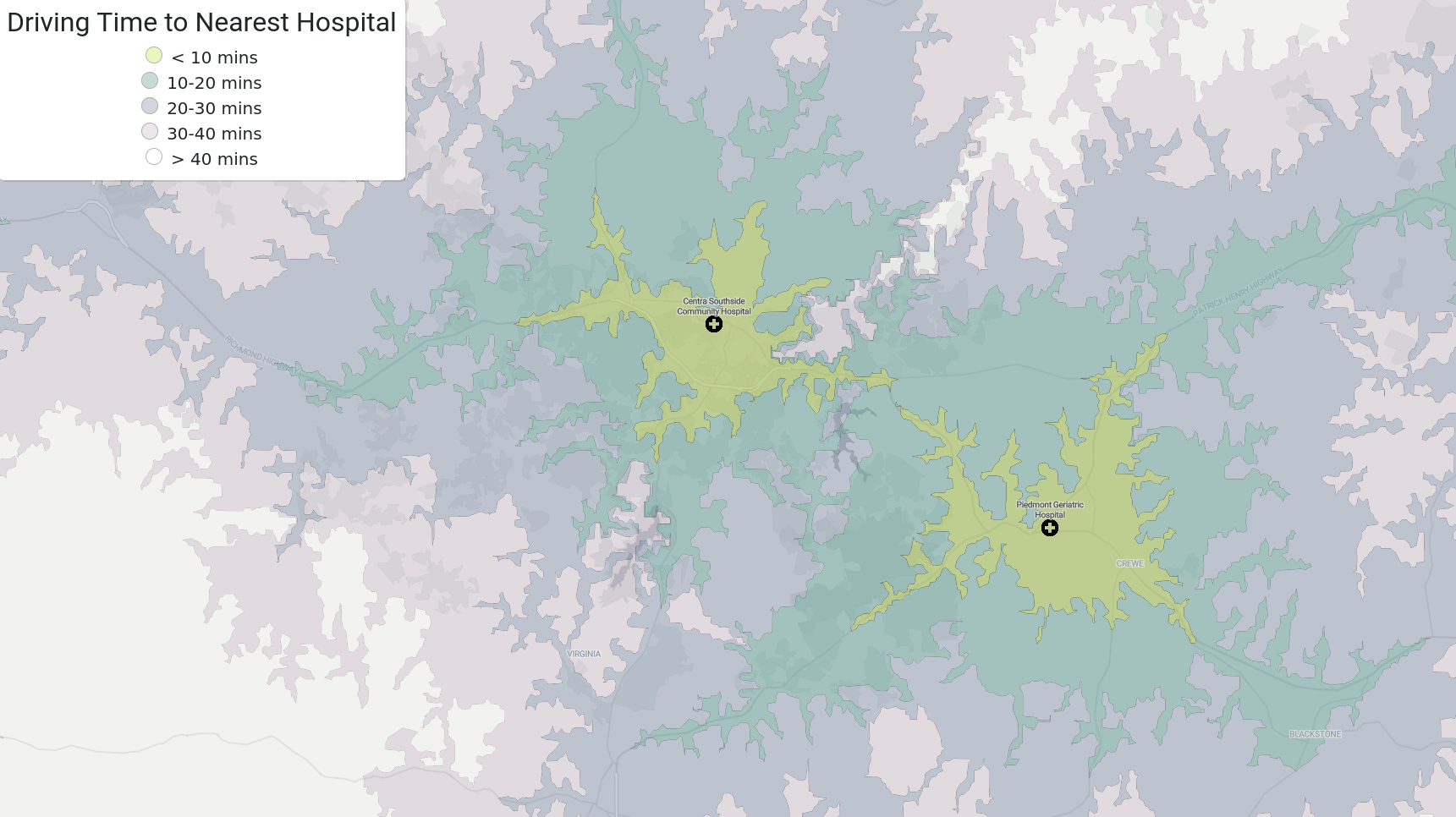
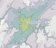
Let's dive into a result showing two hospitals in Virginia. The two lime green splotches around each hospital represent the area that is within a 10 minute drive of either hospital. The turquoise boundary indicates the area where the drive time would be between 10-20 minutes. The purple boundary represents 20-30 minutes, and the pink boundary represents 30-40 minutes. White represents a drive of at least 40 minutes to a hospital.
This can be displayed for the entire state:
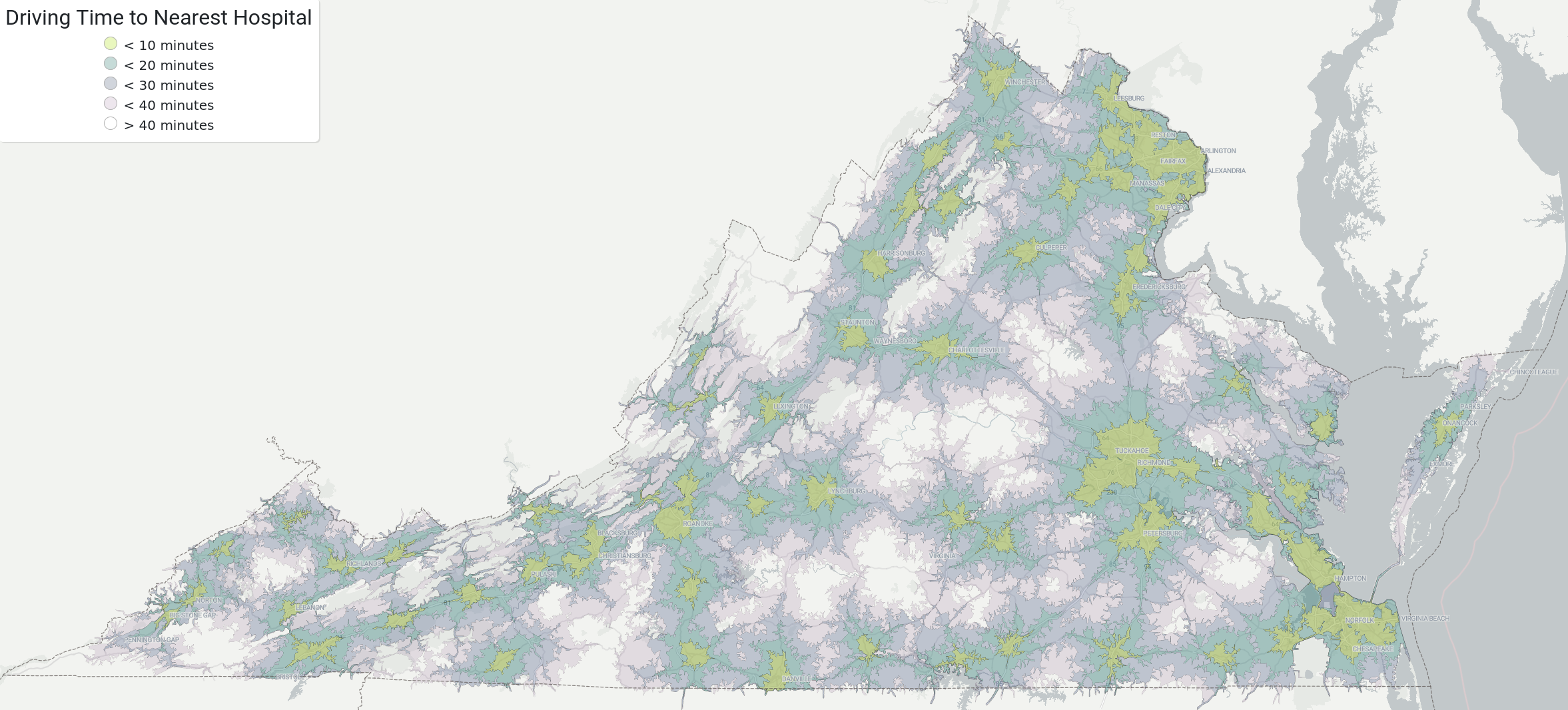
Even at a high level, we can see regions with better and worse hospital accessibility. Generally, hospitals cluster around cities, which can also be seen here. Northern VA, Richmond, Norfolk and VA Beach show up mostly green. Low-accessibility areas (white) are mostly in central and southwest VA.
Population Analysis
Although it's clear many places in Virginia are far from hospitals (plenty of white on the map), I was curious what percentage of residents this distribution truly affects. Since most Americans live in cities, perhaps these areas are mostly unpopulated.
To answer this question, I turned to a dataset provided by the European Union: The Global Human Settlement Layer (GHS) Population dataset 6. This dataset provides an estimate of population distribution across the entire globe. The dataset is formatted as an image of 100m x 100m squares, each containing the estimated population residing in each square.
The following image shows the raw data provided in an extract of this dataset. The brighter colors indicate a higher population. The concentrations of bright colors indicate cities. However, due to the unconventional projection used (Mollweide 7), the image appears slanted and skewed compared to a more traditional projection. The missing chunk in the bottom right corner is the Atlantic Ocean.

Rasterstats
The Python library rasterstats 8 was created to calculate statistics over geospatial raster image datasets like GHS-POP. By supplying a polygon and the image file, the library will calculate various statistics about the data contained in that polygon.
Since the dataset is in Mollweide and my polygons are in EPSG:4326, I had to transform the polygons into Mollweide before using them.
def estimate_population(dataset, geom):
  polygon = shape(geom)

  project_to_mollweide = pyproj.Transformer.from_proj(
          pyproj.Proj('epsg:4326'), # source coordinate system
          pyproj.Proj('esri:54009'),
          always_xy=True
  )

  projected = transform(project_to_mollweide.transform, polygon)

  window = geometry_window(dataset, [projected], pad_x=10, pad_y=10)

  dataset.read(masked=True, window=window)[0]

  zs = zonal_stats(projected, GHS_POP_FILENAME, stats="sum")
  return round(zs[0]["sum"])
To sanity check my approach for estimating population, I used the boundaries of Washington DC, and compared the result to the official census record.
with open("dc.json", "r") as f:
   dc_geom = json.load(f)

print(estimate_population(dataset, dc_geom))
This outputs:
707662
Compared to the official 2020 census estimate 9 of 712,816, this is off by less than 1%. Not bad!
Population Estimates on Hospital Isochrones
In my case, I just needed to sum all the values inside the polygon to get the total population. I just supplied each multipolygon of joined contours at each level (10 mins, 20 mins, 30 mins, and 40 mins), and the library calculated the population within each one.
Another consideration was that I needed to intersect the Virginia state boundary with the Isochrones that were calculated. This is due to an artifact of how OSM extracts work. When OSM extracts get made, they do not cut off existing features exactly at state boundaries. So our dataset includes roads in bordering states, which means our isochrones will leak into these states as well.
If we allowed this leakage to happen, our population estimates would include some residents from neighboring states, causing a misleading statistic when calculating the percentage.
However, using shapely, we can calculate the intersection of the VA boundary against the
isochrones to remove any residents from other states.
In the intersection, we can see that the isochrone boundaries no longer leak into other states.
with open("states.json", "r") as f:
    states = json.load(f)

virginia = states["features"][46]
va_geom = shape(virginia["geometry"])
in_va = estimate_population(dataset, va_geom)

print(f"Estimated population of Virginia: {in_va}")

times = [40, 30, 20, 10]

for i in range(4):
  with open(f"polygon_{i}.json", "r") as f:
      iso_geom = shape(json.load(f))

  # intersection is needed to cut off isochrones that extend beyond VA borders
  # this is because the OSM extract includes roads that don't
  # get cut strictly at the border, but extend into other states
  # we don't want to include those populations in the numerator
  iso_va_intersection = va_geom.intersection(iso_geom)

  near_hospitals = estimate_population(dataset, iso_va_intersection)

  print(f"Estimated {near_hospitals} residents within {times[i]} mins of a hospital.")
  print(f"{near_hospitals / in_va * 100} percent of Virginia residents")
  print()
When reformatted into a table for readability:
Total Estimated VA Population: 8,433,266
| Travel Time (mins) | Population | VA Pop. (%) | VA Area. (%) |
|---|---|---|---|
| 10 | 5,514,068 | 65.38 | 9.11 |
| 20 | 7,454,683 | 88.40 | 31.68 |
| 30 | 8,094,637 | 95.98 | 59.29 |
| 40 | 8,343,513 | 98.94 | 80.44 |
Conclusions
These results are kind of surprising! From the map, it's not obvious that 99% of Virginia residents are within 40 minutes of a hospital because there is a lot of white space on the map. It's also interesting that 65% of the population lives in 9% of the area that's within 10 minutes of a hospital.
Another interesting conclusion is that only 1% of the VA population lives in the remaining 20% of Virginia which is 40+ minutes from a hospital.
On the other hand, looking at distance to the nearest hospital is only one piece of the puzzle. This metric by itself is a bit optimistic because it does not account for the services offered at each hospital. A patient seeking specialty care would find no comfort living next to a hospital that doesn't provide what they need. This metric also does not account for the value of multiple hospitals nearby, which would grant more options to patients than a singular monopoly in the region.
The data here is also crowd-sourced, and may not be 100% accurate or up to date.
I went through the data and found some places where hospitals were tagged incorrectly. In many cases, clinics were tagged as hospitals. I also found some "veterinary hospitals" tagged as hospitals and fixed these occurrences.
In my reddit post on /r/dataisbeautiful, some users pointed out other inaccuracies, such as hospitals that have since closed down. I fixed the data where possible in OpenStreetMap, but other errors may still exist.
If you see any more, feel free to point them my way, or fix them yourself on OpenStreetMap.
Creating the Self-Hosted Interactive Map
Once I had the data, I still wanted to display it in a more interactive format. It's one thing to see the data on my own computer, but I wanted to share it with the world!
Normally, this would require setting up a backend to serve map tiles. However, using some new open source tools, I could create an interactive map with only a few MB of files hosted in a CDN. No backend is required. No paid subscription to a service like Google Maps or Mapbox. No additional costs.
I was inspired by Kevin Schaul's article10 about The Washington Post adopting open source tools for their map visualizations, so I started out with the tools he suggested.
MapLibreGL 11
This is the frontend client used to display the map. It supports panning and zooming around the map, making it interactive.
The project is an open source fork of Mapbox GL JS, which was originally open source, but later versions were relicensed by Mapbox as proprietary. This library uses vector tiles rather than raster tiles, reducing the size of data transferred from the backend.
Protomaps 12
This awesome piece of software is changing the game for serving map tiles. Instead of requiring a tile server running on a backend to serve tiles at specific coordinates, Protomaps uses HTTP range requests to directly query a single file, which can be hosted as a static asset on a CDN.
This approach is similar to how web clients streaming video can seek to a timestamp without downloading the whole file. The client only downloads what they need, rather than burdening the server with unnecessary bandwidth. This also saves time for the client.
Allegedly, this reduces the cost of hosting tiles to 1% of the cost using a tile server.13
OpenMapTiles 14
This tool is used to generate vector tiles, which are needed to display a "base map" of my region, to provide context to the data. This shows things like major roads, city names, borders, and other landmark features.
I initially used this tool to create the base map, but after some research, I discovered Planetiler is a better alternative.
Planetiler 15
Planetiler also generates vector tiles, so it's an alternative to OpenMapTiles. However, it's way faster. OpenMapTiles took around 3 hours to generate a base map with the GeoFabrik US South extract 16. Planetiler took just 3 minutes.
Tippecanoe 17
Used for generating custom vector tiles. In my case, I used these to convert my GeoJSON isochrone boundaries into map tiles. This improves performance of the client by transferring the data only as needed. With a tiled approach, only higher zoom levels will render the fully detailed polygon.
I also used the go-pmtiles project to convert these into the Protomaps tile format, because tippecanoe does not yet support direct conversion to PMTiles.
OpenMapTiles/fonts 18
This tool was used to generate the font files needed for MapLibreGL.
This provides the "glyphs" used for all text on the map.
The glyphs are also self hosted under /public/glyphs.
I initially had some issues installing the dependencies, but I was able to get them installed
by using node v16.18.0 and manually running npm install [email protected] before installing the
project dependencies.
Generating the Files
The basic steps I took were:
- Generate base map tiles with planetiler
- Convert the GeoJSON isochrone polygons into MBTiles with
tippecanoe - Convert the MBTiles into PMTiles with
go-pmtiles - Set up the frontend with MapLibreGL to use the base map tiles
- Tweak a style.json file for styling these tiles
- Add a PMTiles data source for the isochrones layer
- Add a layer into the style.json spec for displaying the isochrones sources (I had to pick which layers should be above or below this to look right)
- Add a GeoJSON data source for the hospital locations and names
- Add a layer into the style spec for displaying these names with a custom symbol I made in GIMP
A note on colors
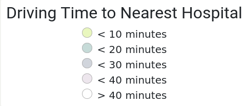
I based the color of each distance threshold on the viridis color scheme, which uses yellow on one end and dark purple on the other.

However, due to opacity and how the polygons were layered on top of each other, the colors didn't quite come out right. The colors shown on the legend would match the colors of the polygon if opacity was set to 1. But because they're transparent, the background colors bleed into them. This resulted in a confusing color scale in my legend, as many users on /r/dataisbeautiful tactfully pointed out.
Bad legend colors:
I couldn't figure out how to determine the actual color as presented in the map, so I ended up taking a screenshot and finding the RGB values with a color inspector tool. But even using those values, the colors still looked wrong.
I think this was because of the way that colors can appear different to the brain based on context. For example, the Checker Shadow Illusion.
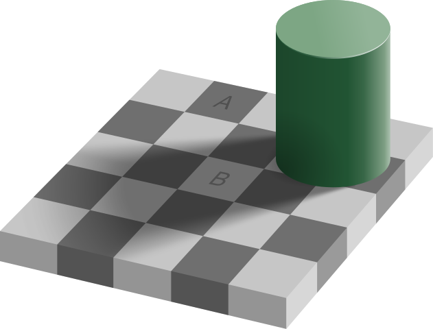
The colors of A and B are actually the same. 100% identical RGB codes. This hurts my brain.
I ended up just tweaking these colors manually until they looked about right to me.
The colors still don't match 100%, but at least they can be matched to the corresponding map color now.
Code
The repo for generating this analysis can be found at wcedmisten/hospital-accessibility-map
And the frontend code for the interactive map can be found here, with all the other source code powering this blog.
Future Work
Scale
I'd like to get this visualization set up for the entire United States, and eventually compare metrics between states.
As an intermediate step, I ran this code with an extract of the US South region.
One issue I ran into was that WebGL, which is used by MapLibreGL to render vector tiles, can only render 65,535 vertices. With my massive isochrone polygons, I was hitting this limit at low zoom levels.
The solution to this was to pass --simplify 6 to my tippecanoe file generation
command, to reduce the number of points needed for each polygon.
This also reduces the accuracy slightly, but at high zoom levels it's
not really noticeable.
Filtering by Service
Another enhancement would be to allow filtering hospitals by services offered. It would be interesting to see how this map looks for a patient seeking specialty medicine. I'm not quite sure where to get a standardized dataset of services offered by hospital, so if anyone has a suggestion, please reach out!